


When designing a website it’s important that it is easy to navigate and visually appealing on both a desktop and a mobile device. There are two ways to design a website so that it will work on both a computer and a smartphone, these are called Responsive Design and Mobile First.
Responsive Design
Responsive design refers to how the layout or design of a website changes based on the screen size or orientation of the device being used. This means that often when the screen becomes smaller, items on the websites will either re-arrange or hide. You might hear a website designer reference responsive design when they say, “on mobile this will stack.” This approach to web design was common years ago and we’re still seeing new sites come out with this.
The other thing that makes responsive design stand out is three defined “breaking points.” Breaking points refer to how wide a screen can be before it may re-arrange or hide certain design elements. Most responsive templates would have an individual breakpoint for each device (mobile, tablet, and desktop). A tablet’s breakpoint is around 1024 pixels (the width of the original iPad) and a desktop’s breakpoint is often 1200 pixels at minimum. This makes these two devices very similar when it comes to responsive design. However, with the breakpoint for a mobile device being around 767 pixels there is potential for missing elements on the mobile website.
Mobile First
With a Mobile First design approach, the web designer is expecting that most website visitors will be viewing your website on a mobile device. This ensures the entire website is easy to use on a phone. This doesn’t diminish the design or ease of use on a tablet or desktop either. However when a person visits the website on an iPad or Desktop they may expect an enhanced experience.
Responsive Design vs. Mobile First
To a template designer using a third-party framework, it becomes apparent the differences between a website using the two design types. In a Responsive Design template, you may have a 12 column layout. To convert a three-column desktop footer to a stacked mobile footer, you set it to small -12 desktop – 4 (as 4 times 3 is 12). In Mobile First, the mobile setting is the default, so instead of small -12, it would just be size -12.
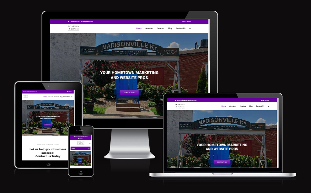
In a Responsive Design template to hide something on the mobile version it must be set to hidden-small. This means everything that isn’t considered “small” would show. In a Mobile First template, you set it to hidden, and then tell it on a medium screen to show. In the photo from Am I Responsive below, you see how our own website adjusts for the various screen sizes.
So Which One Should I Choose?
As more people use smartphones to browse the web it’s important that websites are not lacking design elements on mobile. Not only is this important for ease of use but it’s also important when it comes to SEO. Google indexes the mobile version of websites now. If a website needs to rank on Google for specific terms those terms must be present on the mobile version. If those terms are hidden on the mobile website then Google is unable to index the website. To design a website that’s easy to navigate on both a desktop and a mobile device, we recommend Mobile First.